

Got Climate Angst? There’s a map for that

SHOULD HE BUY THAT SEASON PASS OR NOT?
Fast-forward to Hurricane Sandy in 2012, the year he completed his doctoral studies in geography from Penn State University. Did that devastating storm change any minds or perceptions about climate change, especially those in harm’s way? If so, were they more inclined to support local and state policies to buffer future storms?
Politics is local and Howe has a hunch that climate change might be, too. He joined Utah State University as an assistant professor of human-environment geography in the S.J. & Jessie E. Quinney College of Natural Resources in 2013, following work as a postdoctoral associate at Yale.
Thanks to Yale, he already has an im-pressive array of data chronicling what Americans think about global warming, mined from a nationwide survey of 18,000 respondents over eight years. The data was collected as part of the Climate Change in the American Mind project led by the Yale Program on Climate Change Communication and the George Mason University Center for Climate Change Communication.
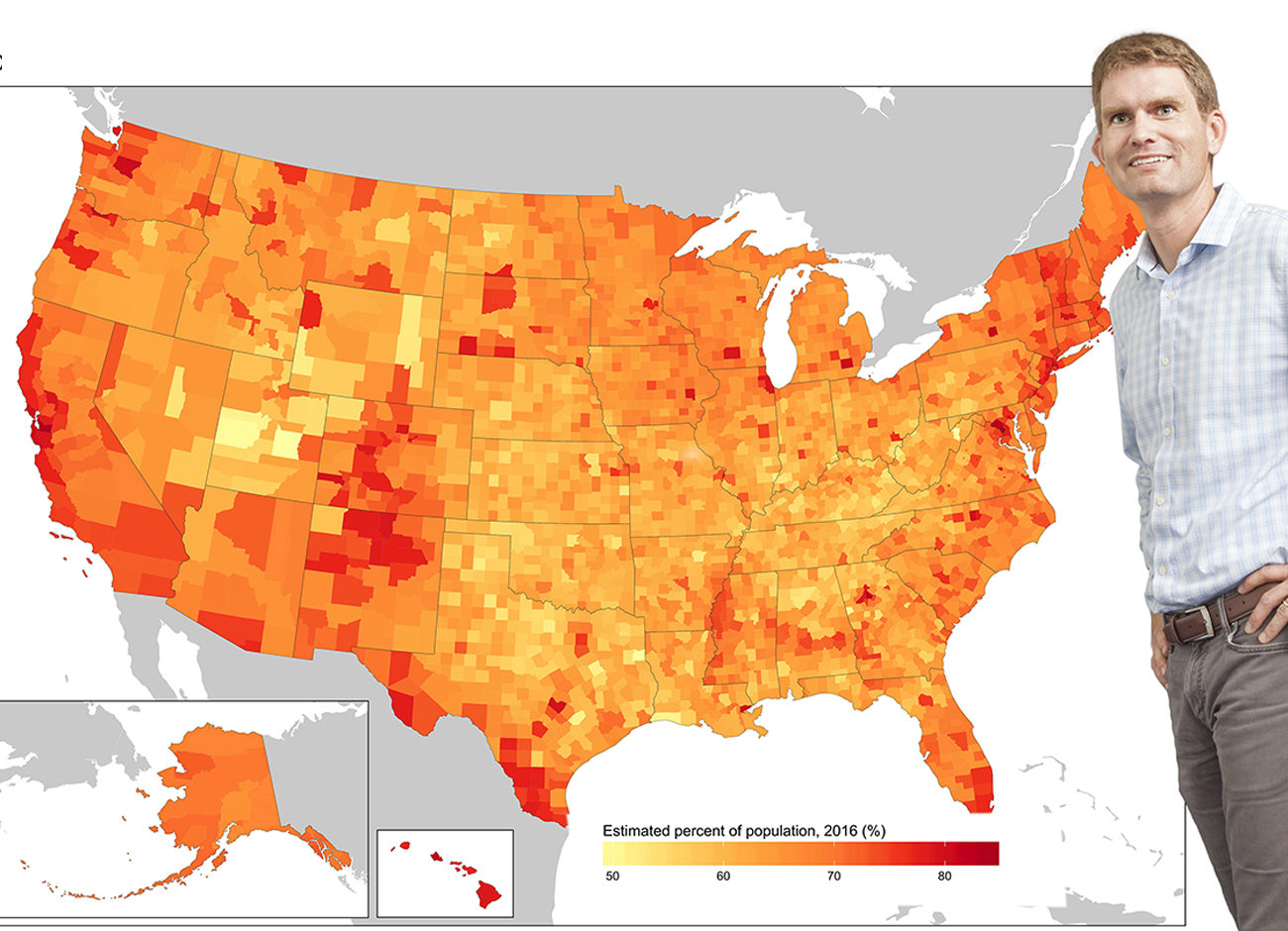
And thanks to a project Howe led three years ago, American opinion about global warming is now all over the map. That is because Howe and three Yale colleagues created the Yale Climate Opinion Maps referenced in 598 media reports since 2015, including four stories in the New York Times, six in the Washington Post, and five on CNN. In addition, their first academic paper on the climate opinion maps in Nature Climate Change has been cited 108 times in academic literature since 2015.
Howe, a geographer at heart, appreciates the utilitarian aspects of maps. He likes how they can provide both overview and detail all in one glance. Maps that he can divide into categories and color-code into percentages. Maps that he can digitize and deliver to computers and smartphones across the globe. Maps that tackle the tough terrain of the numeral-laden peaks and valleys that comprise the mindscape of American opinion. Quick guides for data-weary eyes that break down the “what’s” and “how’s” of American opinion regarding climate change. The “where’s” as well, right down to all 3,142 U.S. counties, 435 U.S. Congressional districts, and 916 metropolitan areas. Maps that jump to life with the swipe of a mouse.
Hover your cursor over Cache County and you will see that 63 percent of residents believe global warming is real, compared to 81 percent of those living in Tompkins County, New York. Mia Love may be interested to know that 65 percent of her constituents support strict carbon dioxide limits on existing coal-fired power plants, while a little more than the 58 percent in John Curtis’s adjoining district, that inclu-des Carbon County, also favor such limits.
It provides invaluable data for policy-makers because it quickly shows them what their constituents are thinking and how they compare to other constituents around the state and country. Interestingly, United States residents overall are concerned about global warming and support measures to help lessen its impacts, according to the Yale opinion maps.
These numbers suggest that elected officials may be underestimating the degree of support among the public for doing more in terms of climate mitigation. Likely in part due to the polarizing issues attached to climate science. Nevertheless, the maps show that most people do support renewable energy and reducing air pollution, whether they think or worry that climate change is happening or not, Howe says.
It is all there on the map to guide people through the decision-making process, and it is only going to get better. In April, the National Science Foundation awarded Howe a five-year grant that will enable him to improve mathematical models underlying the opinion maps. As a result, we can expect to understand more fully how people are responding to climate change around the country.
He will also be conducting research on how best to visualize the data in ways that will be accessible to anyone interested in using the results—decision-makers and the public alike.
By being able to refine and improve his earlier data models, he will be able to, for the first time, look at how people’s perceptions and opinions about climate change are changing over time as well.
“It is a dynamic process,” he says. “We are experiencing its impacts now and will likely experience more impacts in the future.”
As we see those impacts, it will most likely change people’s perceptions and affect the decisions needed to more effectively respond, Howe says.
“We want to have tools like this available for policy and decision makers on the ground to see things like, for example, people in Houston. Do they now support more investment in flood protection infrastructure? Or say, new regulations for managing retreating coastlines where sea-level rise is an issue. Or here in Utah, decisions surrounding water supplies,” he says.
Howe’s initial survey goes out this fall and will sample about 5,000 people with an aim to increase that number in subsequent years through follow-up surveys. This allows him to gauge how people’s perceptions, behaviors, and decisions are changing—or not—in response to weather fluctuations or other events they may or may not be experiencing. Howe hopes to release his new, more detailed maps by the summer of 2019.
In the meantime, should you buy that ski pass? Well, if you trust climate scien-tists—and 71 percent of the nation does, including 64 percent of Utahns—the world is not getting any cooler. The consensus shows that global warming is a serious problem, Howe says.
“Of course, in science, there is never 100 percent certainty about anything, but to me, it’s a question of risk management,” he says. “If the risks are incredibly weighted toward this being a real problem that we need to respond to, then it makes sense to prepare, to make the decisions that will set us up to be ready for these changes. And if they end up being not as bad as we forecast them to be, that’s great. But we need to be ready, regardless.”
Howe hopes his maps will help every-body to do just that, and in the process, help keep Utah on the map for the Greatest Snow on Earth.


