

Building a Mammoth Brand: Alum Ben Barnes on Designing the Logo for Utah’s Newest Pro Team
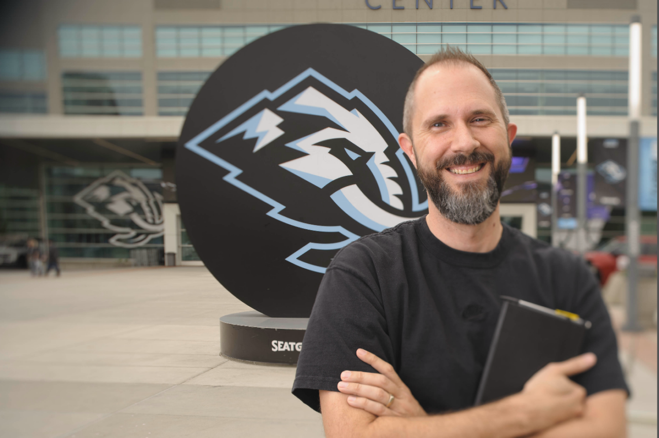

By Liz Lord ’04 | Photos by Levi Sim
How do you draw a mammoth? Specifically, how do you refine a sketch of a giant prehistoric mammal into an instantly recognizable symbol? One that can glide seamlessly into the pantheon of national sports brands, as the face of a freshly minted NHL franchise — with the power to drive millions in ticket and merchandise sales? Most importantly, how do you design a logo that will be embraced and beloved by a new generation of eager Utah sports fans?
This was the challenge given to Ben Barnes ’04, senior brand director for the Utah Jazz. He was tapped by Ryan and Ashley Smith — owners of Smith Entertainment Group (SEG), a company whose portfolio includes the Utah Jazz, the Delta Center, and now the Utah Mammoth — to help design a high-profile logo, in partnership with Doubleday & Cartwright, that would carry the pride of an entire state on its enormous tusks. It’s the kind of task that is anything but small.
To meet the challenge head-on, Barnes pulled from his graphic design education at USU, his 22 years of branding experience, and his passion for creating sports logos, to think outside the box — or in this case, outside the goal crease.
This interview has been edited for space, clarity, and concision.
A GIANT IN THE MAKING

Q: What challenges were you trying to solve with the Utah Mammoth logo?
A: As the newest NHL franchise, we had a strong desire to show we belong, that we do things world class. We wanted our visual identity to be something that Utah could be proud of and would uniquely fit us in this space. Because it’s a crowded marketplace of sports teams, right? More than that, what makes this mammoth uniquely Utah’s mammoth? For example, the mammoths that were found in Utah are Colombian mammoths. They’re not the wooly mammoth that you would expect. So, it’s trying to dig deeper to find something that had local meaning, aside from, “Let’s make a cool-looking mammoth.”
Professional sports’ visual identities are also more than just a primary mark. There’s often a suite of complimentary marks that help reinforce that primary logo, act as supplemental identifiers on merchandise, marketing materials, etc. We knew it needed to be a system that had some legs and could work in lots of different capacities. It was also very important to Ryan and Ashley Smith, our owners, that the fans be involved. [SEG invited fans to vote on team names and logos over a period of 13 months, with over 850,000 people participating.] That was unique. It helped create an elevated connection between the fans and the team that I really hadn’t experienced in other jobs like this before
Q: Brainstorming is always a key part of any design process. Are there go-to wells of inspiration that you draw from when starting a project?
A: It’s important when designing for sports, you understand the world in which that team’s brand will live. You want it to feel like it belongs next to — but also hopefully above — some of these other logo systems in the league. How have others solved the challenge? It’s important to make sure what you’re creating feels like it belongs in the space but also feels unique and ownable.
As far as inspiration, I’ve been designing visual identities for sports for over 20 years. There is some institutional knowledge I lean on, and it helps inform some of my decisions when getting started. Inspiration can come from anywhere. It’s important to get outside and have curiosity about everything. But for sports branding, you really need to dial in on: Where is this going to live? What does it need to do? And, how can it fit within that world?
Q: Do you have a set process that helps you in the design phase?
A: I’m a very routine-based person. I like a process. It always begins with gathering information, finding out more about the subject matter, seeing what’s out there, looking at references. If it’s a specific mascot or animal, what are their identifiable characteristics? What needs to be there for you to understand it’s that creature? I usually let that marinate before I get sketching, but I always go pencil-to-paper, because it’s a good way to let ideas flow without worrying about it being perfect. Get an early explosion of shapes, gestures, letterforms, without really dialing in on something. I usually put a nice playlist on my headphones. Once I start on a project, it’s hard to compartmentalize that to the time I’m working on it. Ideas can come when you’re in the shower, or asleep at night, or even just driving home from work. I try to not turn it off entirely, because sometimes the best ideas come when you’re not really overthinking it.

Q: How do you sense when a logo is done, and you can finally put down the mouse or pencil and call it good?
A: My coworkers will often hear me say that nothing’s ever really done, it’s just due. Any artist or designer could probably feel that. Due dates are good things, though. Once you get to a point where you’re really liking something and you feel like it could be close to done, it helps to start putting that into real life situations. Instead of just, “Here it is on a white background, on a piece of paper, on your artboard.” Let’s put it on a jumbotron in the arena, on billboards, on jerseys and merchandise. Put it in the environment it’s going to be living in. And that’s when you really start to realize maybe this outline needs to be thicker, or maybe there needs to be more contrast here or there. Because then you’re seeing it as it will live, versus zoomed in on your computer. And it helps in selling it, in getting that idea across for everybody, putting it in that context.
Q: When you add Easter eggs into the logo — like the shape of the state of Utah — who are you designing them for?
A: I have a strong opinion on hidden elements. I think they shouldn’t be done for their own sake. In the case of the mammoth logo, we wanted to make it feel like Utah’s unique mammoth, instead of just a generic design of a mammoth. So, the subtle elements should work within the design by themselves. The crown of the head being a mountain range was important because we wanted to feel like it belonged to Utah. Chiseled out of ice or rock, that gives it a hockey feel. Subtle things that make this an ownable mark, instead of just a (hopefully) nice-looking mammoth logo. We are designing it for everyone, to understand who this team is and what they represent.
Q: What’s one little detail in the logo you think most people will never notice, but you’re proud is there?
A: The thing I’m most proud of with this mark is that a mammoth is a tricky animal to design. They look a little silly, they don’t look like a tough sports logo. Most people think of Manny from Ice Age, or Mr. Snuffleupagus. The big thing we tried to do is take an animal with big, massive, unwieldy tusks and a really, really long trunk, and distill it down to a nice, contained shape. Obviously, the tusks would be much longer, the trunk would be much longer, but you have to take some artistic liberties to make this work as a logo. To me, that was the hardest part. It could have been bad if we tried to be too literal. We were able to make a nice, streamlined, resolute, on-the-attack looking mammoth that feels like a sports logo.
THE USU FACTOR
Q: Which class or assignment at USU was the most influential in shaping how you approach logo design today?
A: I think the answer is Bob Winward’s [logo design] class. One of the things I remember most was needing to have a clear, agreed-upon creative brief before really picking up a pencil. Clear communication with the client is key to success. Having a good understanding of what the task is, and what the expectations are from the get-go is super important. It helps you understand the difference between what the client thinks or feels they like, and what we are trying to accomplish. What are the goals? It helps you focus.
Q: Was there a moment at school when you realized branding, not just graphic design, was something that you wanted to pursue or specialize in?
A: It’s something I wanted to specialize in before I got to Utah State, from when I was a kid through high school. It was always the part of graphic design I liked the most. I certainly received support from my professors — Bob Winward, Dave Smellie, Phil Kesler, Corinne Ellsworth. But there was a moment in my senior portfolio review class, where you show the work you’ve accumulated over the course of your college career and the professor is very matter-of-factly saying, “You need more of this, you need less of that.”

Alan Hashimoto was reviewing my work. My portfolio was full of the regular projects that we’ve been assigned, but I had thrown in a bunch of sports branding that I’d done on the side or as a freelance assignment. Instead of just telling me where I was lacking, he also told me that I had a future in sports design. He told me I should really double down on it and not dilute my portfolio just to make sure I checked all the boxes. He said, “You’re good at this, you should try to get into that.” That was probably the moment I started to feel like this was something I could really do. It was a big confidence boost. I’m always appreciative of Alan for that.
Q: What’s something you learned in school that didn’t make sense then, but now, feels essential to your process?
A: I had a printmaking teacher, Adrian Van Suchtelen. He said something along the lines of, “If you want to learn how to draw a tree, don’t just look at a tree. Look at how people draw trees.” I took that to mean it’s important to understand how those that have come before managed — good or bad — to solve the same problems you’re faced with. You’re not the first person that’s ever had to make a logo. What are the tricks done to make these things good? And what can you learn from that?
Q: How did your graphic design classes at USU prepare you for working with high-stakes clients like pro sports teams?
A: There’s nothing quite like a critique in one of Bob’s classes, right? I think I learned there, specifically, that nothing’s personal. You’re not trying to solve this problem for yourself. Too often, maybe early on in someone’s career, you could be, “Well, that’s not what I wanted. It should be this. I’m the designer, I know more.” And that’s just not how it works. There’s so many stakeholders whose opinions are valid. Understanding that and being able to take the critique and look at it as, “We’re all trying to solve the same problem here,” really helps a lot.
SKATING HIS OWN PATH
Q: Was logo design always the goal, or did it slowly reveal itself through other projects and clients?
A: I’ve always loved logo design — and I probably always loved sports logo design, although I don’t know if, when I was younger, I thought that could be a profession. I just had fun doing it. When I was a kid, my brother and I would make up pretend sports teams. He would come up with the names, and I would make the little helmets for fun. But then in high school, I was really getting into it. I went to Cyprus High School, and there wasn’t an athletic team that I didn’t do a logo for while I was there. They gave me that opportunity, and it was fun.
In college, I would make logos for different teams in my fantasy sports leagues, and I just loved it. Was it always the goal? I hope so, I really put a lot of effort into it. I get really dialed in on things that I like — hyper fixated, maybe a little bit? Loving the idea of symbolism and trying to convey and say a lot through simple shapes. I thought that was really, really fun to do. So, luckily, I get to do that as a profession.

Q: What separates a good logo designer from a great one?
A: I think the masters really distill ideas into simple, bold and elegant designs, and can create an emotional connection. Every brand wants to have that, whether it’s the local bakery, or a big cell phone company, or a sports team. You want to have a deep connection with your customer. Those are the logos that really stand out and stand the test of time.
Q: At what point did you start trusting your own design, taste, and experience enough to specialize in sports branding?
A: There are times when I still feel a little bit of imposter syndrome, like, “Why are you asking me to do this?” But having some early success was helpful. Soon after I graduated from Utah State, I started working with an agency called RARE Design, and my friend and mentor, the late Rodney Richardson [founder of RARE] showed a lot of confidence in me and my work.
The first project I worked on for RARE was just a few months after I graduated, for the 2005 MLS Cup. I was brought in about halfway through the project, and they were looking for someone to help because they’d kind of gotten to a dead end. My portfolio that Alan helped me put together featured work that was in the style they were looking for. Because I’d focused like that, they felt, “Oh, we think we can trust this person to come in and help.” And it kind of snowballed after that, one project after another, working on different sports teams. If you get a lot of repetition on doing something — at-bats as they say — then you feel more confident.
BIG ICE, BIGGER BRAND
Q: How does designing for franchises like the Jazz and the Mammoth differ from other branding work?
A: Sports is one of the few areas where people can get personally offended if you change their logo or don’t give them what they want. I’m a sports fan myself, so I understand the pride that fans display. There’s an emotional connection, a financial investment. It’s a very personal, tribal thing, “My team versus your team.” But that investment and the love for the fans is really what makes designing for sports so fulfilling. Seeing the work that your team has created, worn by people in your community or on television, it’s one of the more rewarding things. You accept that there’s going to be a lot of loud voices and a lot of loud opinions. It’s just the price of business.
Q: What pressure comes from knowing your logo will be worn, tattooed, and loved for generations of sports fans?
A: That’s a commitment, right? Obviously, you want to make it look good if they’re going to go that far. But I don’t know if people tattoo logos because they like the logo. I think they do it because they like the team. It’s humbling, because you’ve got to make this look the best that you can, but you realize the fans aren’t necessarily cheering for the logo. They’re cheering for what that represents — the emotions, experiences, and memories that come from that brand. But you hope it’s something people can look at and go, “Oh, that reminds me of when I was at the game with my grandma or my cousin, and this was a really memorable time for me.” There are a lot of logos out there that are not good, but have good memories associated with them because the brand is so strong. I think the pressure is mostly you want to do your best with something that’s going to be so visible.

Q: How did working with the Jazz prepare you for the Mammoth project? Did it create any preconceived expectations for how the project would go, that you had to unlearn?
A: I think having worked in-house for a sports team for as long as I have was helpful. But also the contract and freelance work for other teams, just having been through it before. Working with the Jazz prepared me because I was familiar with the stakeholders and the fan base. It’s not exactly the same fan base, but Utah sports fans, there are a lot of similarities between each sport. Working on projects like this with your colleagues, for your hometown team, is just special, right? Doing it for the team that you get to see every day, and you live in that town, is different.
Q: What does collaboration look like at that level?
A: From Ryan and Ashley Smith to our team president, Chris Armstrong, we collaborated with an agency, Doubleday & Cartwright. We each have our unique points-of-view that we bring to the table. Different ways in, to see what we could do and what we would like to accomplish. It’s never just one person’s idea, especially on this scale, it’s a lot of back and forth. It’s very strategic. It’s not just me, it’s not just the ownership — it’s everybody together.
Q: What feedback surprised you the most during the brand design process?
A: Something that stood out to me was how important it was to Ryan and Ashley that the team be for the fans in Utah. That was their number one goal. Sports brings so many people together, and my colleagues and I, we’re just stewards of the brand. You could really see how much they cared about presenting [the Mammoth] in a world-class way to the fans in Utah. You see that with the Jazz as well, and everything that they’ve done with each of these teams.
TUSKS UP: FINAL ROUND
Q: If this logo is still in use decades from now, what do you hope it represents about Utah and its fans?
A: I hope fans can look back and remember the good experiences it’s associated with — where they were when the team started, when they went to their first NHL game. I hope they think of multiple Stanley Cup championships. At the end of the day, we’re representing experiences and memories that we get to be a part of. I think back to when I was a kid going to Jazz games. Memories were being created for me, and I didn’t know that someone was doing that. And to be able to do that for other people now is pretty cool.
Q: What’s something that you want current design students at USU to know about the field of graphic design, that you wish you’d known earlier?
A: You need to really be all in on this. I heard a quote, “If you want it to be your job, don’t treat it like a hobby.” You’ll learn a lot of really great things in college … But after college, be open to listening to those who’ve experienced real-world projects and challenges. Once you have one-week deadlines instead of three-month deadlines, it changes things. Having that desire to make it good — making the design good for its own sake — is also important.

Q: What would your younger self in a USU design class be most shocked to see about how graphic design has changed?
A: This is going to make me feel old, but how much of design now is digital versus print. That change happened my first few years with the Jazz, when all of a sudden, “We need social graphics. We need digital billboards.” How much of design is used for social content would be quite a shocker to college-age me; the concept of social media. I think it’s really easy now to get your work out there.
Q: How do you stay on top of your game as a designer when the use of technology in the field is rapidly changing?
A: Always be curious and try to learn new ways to do things, but don’t throw away the processes and systems that got you to where you are. How can technology help those processes and systems be better? There are ways to become more efficient, and like any tool, trying to stay on top of that can be overwhelming. But utilizing it correctly is the right way to go.
Q: What advice would you give current graphic design students who want to work in design or branding, but feel intimidated or overwhelmed?
A: It’s not supposed to be easy. It’s okay if it’s hard, or if you struggle to get things right. I think that was one of the main things that I learned early on — this is work, this is difficult. Perseverance is key, and some of life’s most rewarding experiences come through pushing through difficulties. Remember what you love about it and lean into that. A lot of people want quick answers and to just post this right now and be finished with it. They want the reward without the struggle, and the struggle makes it so rewarding. It’s supposed to be hard — work is hard. And that’s okay.
Q: What’s a misconception that people have about logo design that this project disproves?
A: A misconception I’ve seen is good-intentioned people post on the internet their versions of, “Well, this is what the team should have done, or this is what I would have done.” Some of it’s good work, too. It’s just so much easier to design when the client is yourself, or when you’re in your echo chamber of your social media bubble. There’s nothing at all wrong with that exercise of creating what you would have done — I did that a lot when I was starting out. Real creative briefs, real stakeholders, real opinions, make it more challenging than you would think. To get these things across the finish line, sometimes that’s one of the greatest rewards — we did it, it’s out there. It’s not an easy task to accomplish.


